
Disha
A dissolvable patch worn on the wrist, for hospitals where getting lost costs more than time.
Systems that demand attention, from people who have none left.
Indoor navigation systems rely heavily on static signage or digital interfaces, both of which break down in high-density, high-stress environments like hospitals. These systems demand attention and interpretation when users are least equipped to process information.
Patients on ordinary visits struggled to find a doctor, a department or a room without stopping someone to ask. Signage was overcrowded and multilingual in theory but practically unreadable under stress, and every bit of added cognitive load raised anxiety and lowered trust in the place. From the hospital's side, staff lost disproportionate time redirecting people who were lost, and nothing existed that was scalable and low-friction without requiring a screen or digital literacy - every option on the market added a new behaviour on top of an already stressful experience instead of removing friction from an existing one.
So the solution had to work for anyone regardless of language, literacy or smartphone access, inside an environment where attention is already compromised, and slot into how hospitals already run without asking staff to change anything.
The navigation problem in hospitals wasn't the absence of technology - it was that every existing solution asked users to do something new in a moment when they had the least capacity to learn.
Under stress, people stop reading and start asking.
Field research across public and private hospitals in Mumbai revealed that users struggled most at moments requiring quick decisions. Signage was inconsistent, crowded spaces reduced visibility, and most users defaulted to asking for help. The key finding wasn't that the signs were bad. It was that under stress, people stop reading and start asking. Any solution that required reading, tapping or following a sequence of steps would face the same problem.
Two further readings came out of it. People were not lost throughout a journey but specifically at intersections, unclear signage zones and departmental transitions - which reframed navigation as guidance at a handful of critical moments rather than a continuous service. And the obvious answer, an app, relied on attention, connectivity and device access, none of which hold up in a hospital.
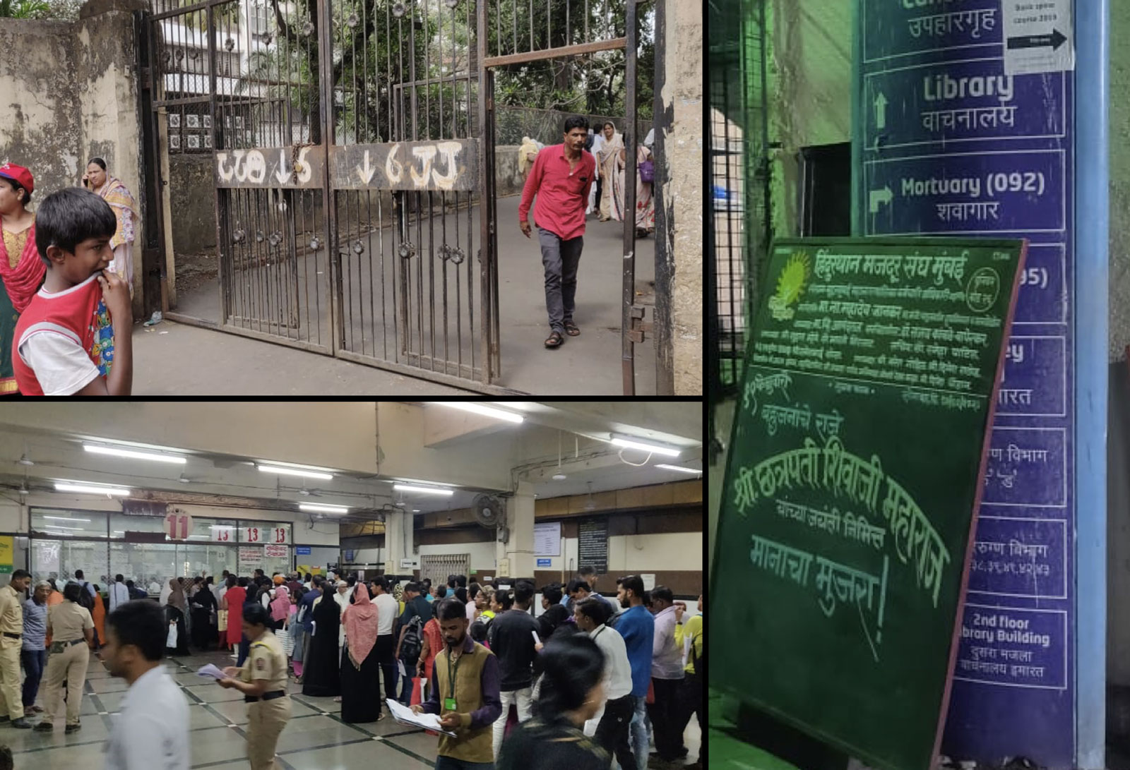
Mumbai, on the ground: direction painted on a gate by hand, a hall too crowded to see across, and a wayfinding board with another board bolted over it.
Three constraints that ruled out every obvious answer.
Research led to three constraints that shaped everything downstream: the solution had to communicate direction without language, add zero learning curve and fit inside an existing behaviour rather than introducing a new one. These constraints ruled out apps, kiosks, digital signage and wearables that required pairing or setup.
Brainstorming spanned all five senses as potential navigation channels - vibration, texture, light, sound and spatial indicators. Vibrating shoes, AR glasses, textured walls and audio guidance all got built out far enough to be judged and rejected. After extensive prototyping, the final concept emerged by combining the most effective elements from multiple directions - directional light display, wrist placement for natural line of sight and a dissolvable material that eliminated the waste problem at scale.
The ideation board. Vibrating shoes, a detachable shoe sensor, AR specs and textured walls all got far enough to be ruled out on the constraints.
Activated at reception, worn like a plaster, gone in two days.
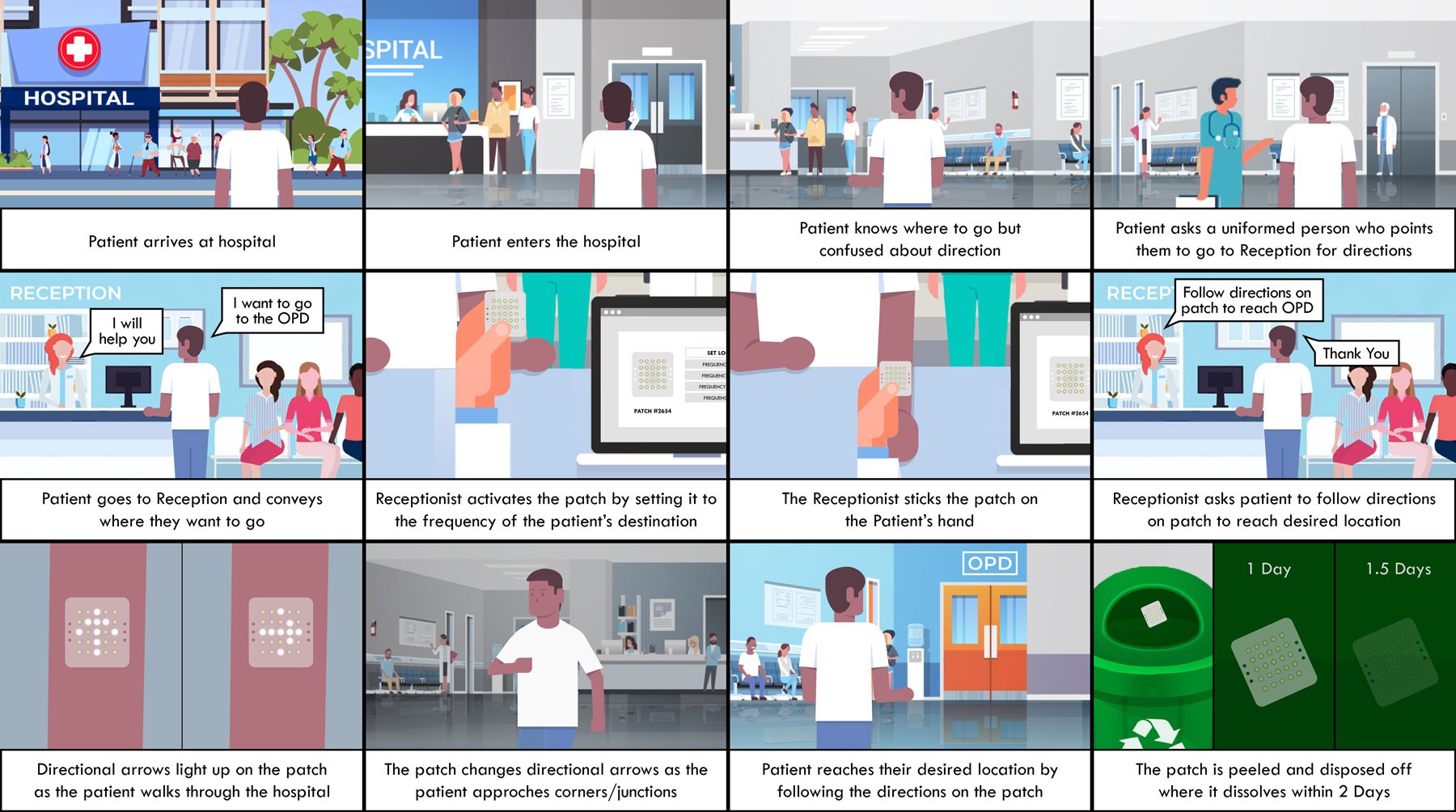
Disha is made of three components working together: a dissolvable microprocessor, LED paint arranged in a directional grid and zinc air batteries. WiFi routers within the hospital structure transmit signals to the patch, which triangulates the wearer's position and lights up the relevant directional arrows in real time as they walk - updating automatically at corners and junctions.
The use flow was designed entirely around existing hospital behaviour: the receptionist activates the patch, sets the destination frequency and applies it to the patient's wrist like a bandaid. After use, the patch is peeled off and disposed - it dissolves within 2 days, leaving no waste.
Four decisions hold it together. The patch itself is the interface, showing direction through light at decision points rather than asking anyone to read. Activation happens at reception, a touchpoint that already exists on every hospital visit, so no new behaviour is introduced for patient or staff. WiFi triangulation was chosen because it uses infrastructure hospitals already have, requiring no new hardware. And the dissolvable material means scale creates no waste - a hospital issuing hundreds a day leaves no material footprint.
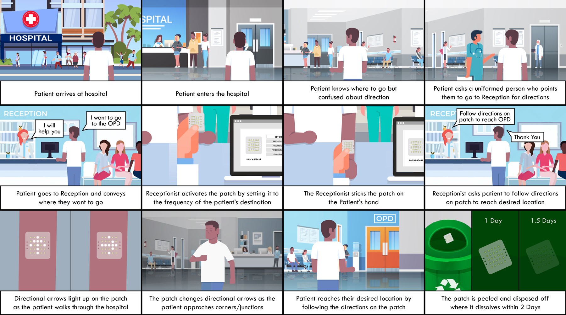
The whole flow in twelve panels: arrive, ask, reception sets the frequency and applies the patch, arrows change at each junction, and the patch dissolves within two days of disposal.
How it works: the patch triangulating off the hospital's own WiFi, arrows redrawing at each junction.
Applying it. The whole interaction is a receptionist setting a frequency and sticking a patch to a wrist.
The only non-digital answer in the room.
Disha remains a concept rather than a deployed product. It was featured at Dubai Design Week 2020 and the Global Grad Show, and drew direct interest from multiple medical institutes and private investors off the back of those showcases.
It was also the only non-digital solution in the wayfinding category at both - a direct result of rejecting the obvious answer early. Designing against the expected solution produced something more appropriate to the context, and considerably more memorable, than an app would have been.
The product film, as it was shown at Dubai Design Week.
The concept is strong. The deployment system is the real work.
Disha pushed me toward a kind of constraint-led thinking that most digital product work doesn't demand. When you remove the screen as an option, you stop defaulting to the familiar and start asking more fundamental questions about how people actually behave under stress. If I were to take this further, the next design challenge isn't the patient experience - it's the operational layer: how hospitals manage patch inventory, how receptionists are trained and how the WiFi triangulation behaves in older hospital buildings. The product concept is strong. The deployment system is where the real design work remains.