
Accreda
A market full of platforms selling courses, and none of them selling a route from learning to being hireable.
Plenty of courses, no route to being hireable.
Traditional education systems fail to translate into real-world employability. Learners had no structured way to progress, validate their skills or see tangible career outcomes from the content they consumed. The market was full of platforms offering courses but none offering a coherent path from learning to being hireable.
For learners that showed up in three ways: courses sat in isolation with no clear next step, there was no credible way to validate a skill or show proof of it, and almost no visibility into what any of the learning would actually produce as a career outcome. The business had a different set - low differentiation in a crowded market of near-identical competitors, weak conversion and engagement across both the direct-to-learner and direct-to-business journeys, and no single platform experience that could serve individual learners and enterprise clients without splitting into two products.
The hardest part was designing for two fundamentally different mental models - an individual learner figuring out their career, and an enterprise buyer evaluating ROI for their team - inside one product shell, without it ending up built for neither.
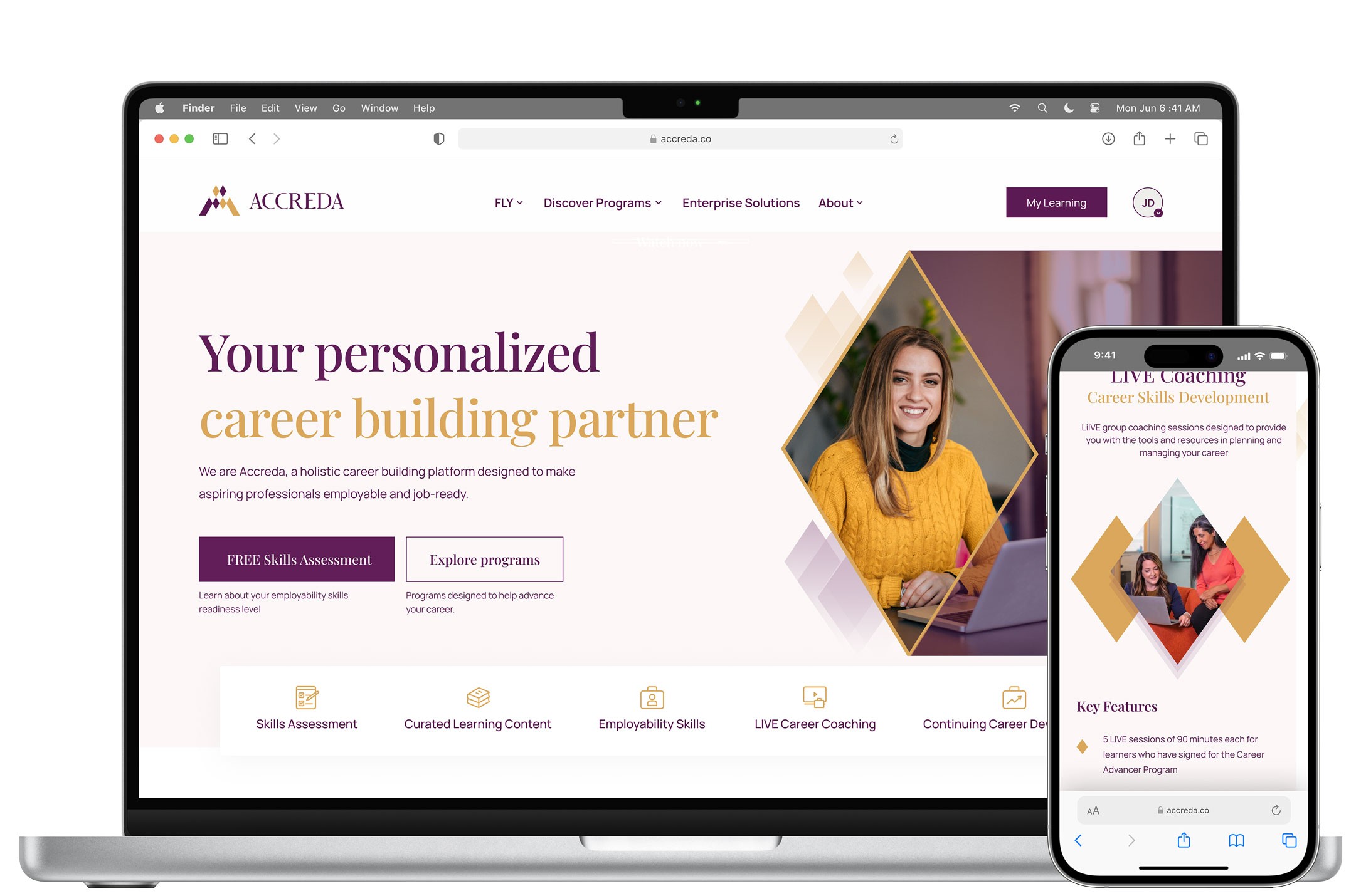
The platform on desktop and mobile: a skills assessment as the front door, and live career coaching alongside the programs.
The problem wasn't access to learning - it was the lack of structured progression and proof of capability.
Interested at discovery, not confident enough to commit.
Research revealed a consistent pattern across all user types: high intent at awareness, confusion at discovery, hesitation at decision and disengagement at retention. The drop-off at decision stage was the most critical - users had enough information to be interested but not enough confidence to commit. This single finding shifted the entire product direction and became the lens through which every subsequent design decision was made.
Four personas carried it, split evenly across the two audiences the platform had to serve at once - two individual learners and two enterprise buyers. Each was mapped end to end across awareness, discovery, decision and retention, which is what made the drop-off legible as a pattern rather than a complaint.
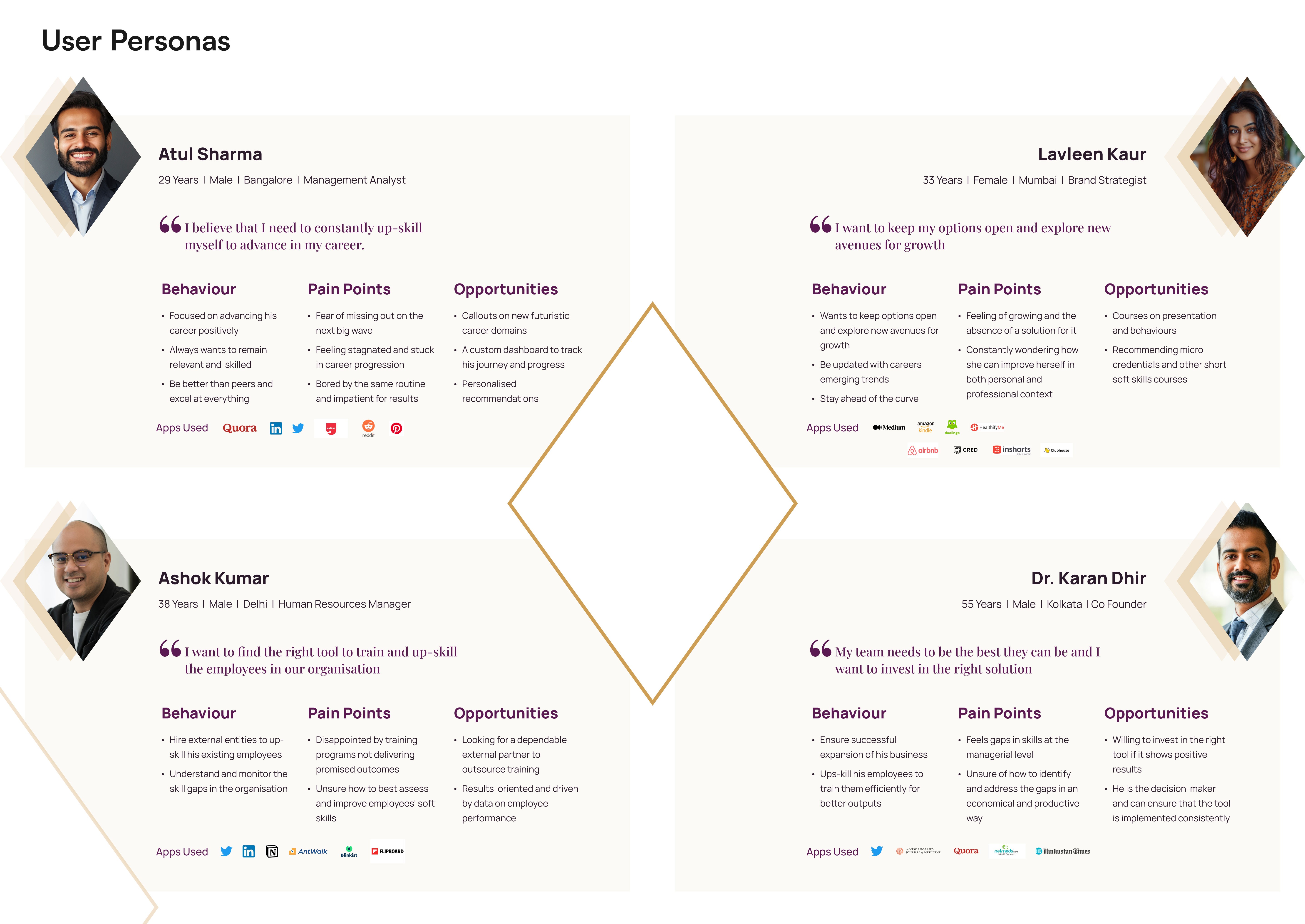
Two learners and two enterprise buyers - an HR manager and a founder - because the platform had to answer both without forking.
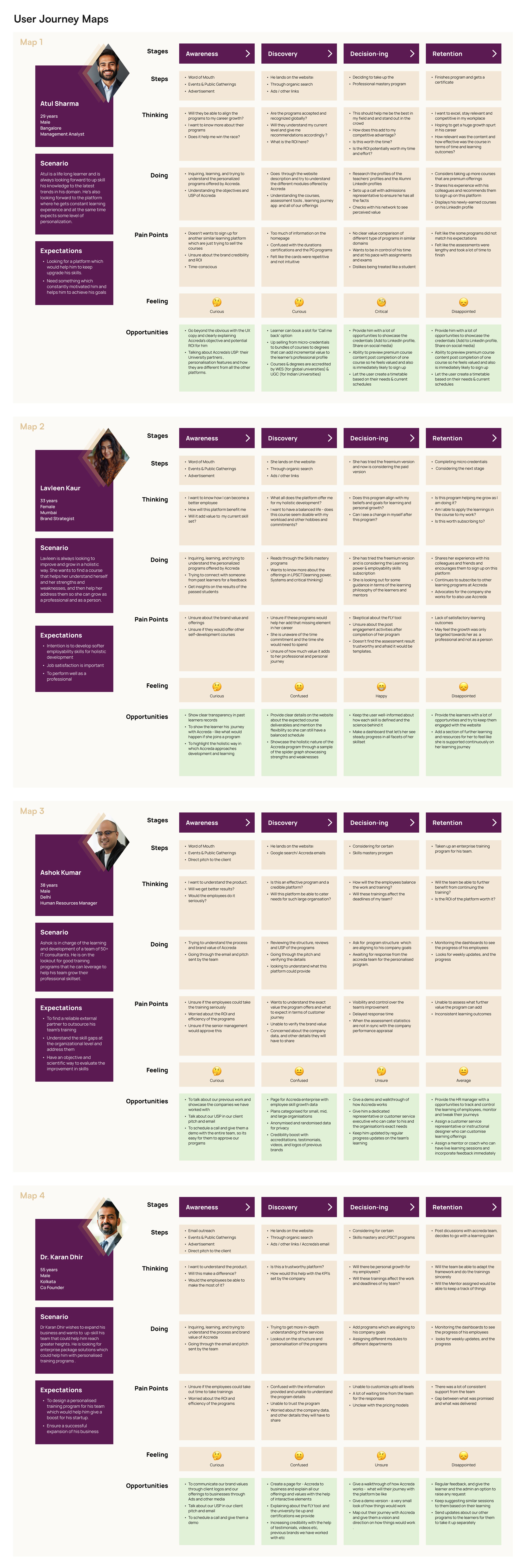
All four mapped across awareness, discovery, decision and retention. The feeling row runs curious, confused, unsure, disappointed - the drop-off, visible.
Pathways over courses, and one platform instead of two.
Three things came out of the research and set the direction. Learning journeys lacked continuity - people arrived with intent and dropped off against unclear progression and disconnected content, which called for a structured pathway rather than isolated course discovery. Outcomes needed to be visible and credible, because learning was only valued when it turned into something tangible, which pushed validation and outcome visibility to the centre of the experience. And the two audiences needed one system, flexible enough that learners and enterprise clients could use the same structure differently without the experience being built twice.
The product direction shifted from a course-first model to a pathway-led structure - a deliberate call to prioritise where users end up over what content they can access. Four design principles anchored the work from this point: Personalisation, Interactivity, Simplicity and Immersiveness. A key structural decision was made here to not split the platform into separate learner and enterprise products, but to use shared IA with distinct dashboard states and contextually relevant content for each audience type.
Three calls did the most work downstream: navigation moved from course-based to pathway-led for clarity and engagement; validation and outcomes were prioritised over content volume, which is what separates the platform from a generic course catalogue; and the dual audiences were served inside one system rather than two, so neither got a second-class experience.
FLY, and a dashboard that shows growth rather than completion.
Four things carried the experience. Career pathways guide someone from discovery to mastery by surfacing skills, timelines and outcomes upfront, which is what removes the ambiguity at the decision point. FLY - Forever Learning and You - is the skill validation framework, and it turns assessments and certifications into credible, shareable proof of capability. The learner dashboard makes growth visible over time rather than reporting course completion, which gives a returning user a reason to come back. And the platform pulls university content, LMS systems and proprietary tools into one experience so the journey stays consistent across all of them.
The final UI system was built around Accreda's brand identity - deep purple and gold as the primary palette, cream secondary tones for breathing room. Playfair Display was chosen for expressive, premium-feeling headings and Manrope for UI clarity across body and functional text. A custom iconography set was designed specifically for the learning ecosystem rather than adapted from a generic library - every icon was built to reinforce the platform's core values across all 10+ screen types.
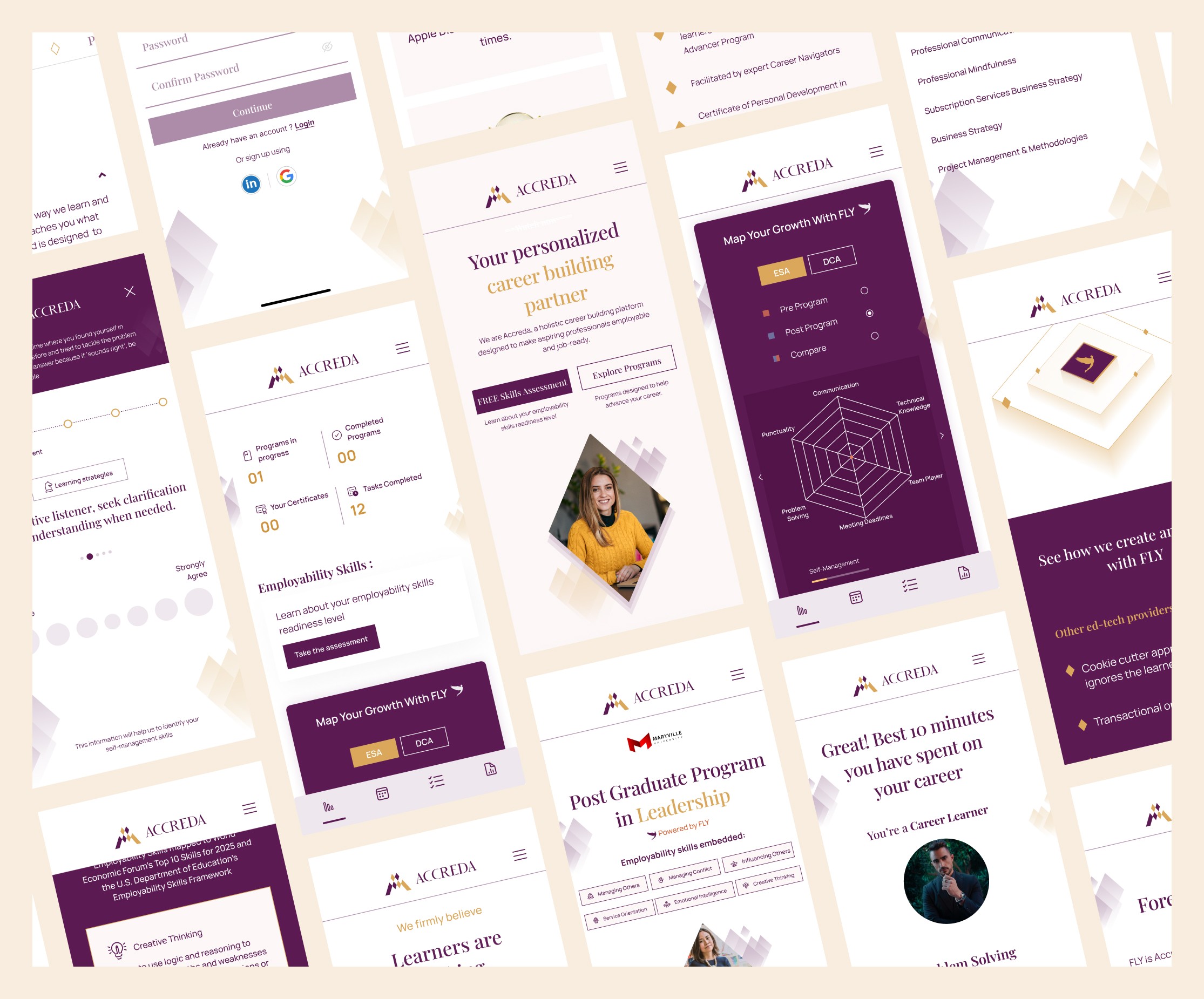
On mobile: the learner dashboard, and the FLY growth map plotting eight skills before and after a program.
Conversion up by more than a third, and one product rather than two.
The conversion improvement wasn't a single design win - it came from a combination of three changes: shifting navigation from course-based to pathway-led reduced decision fatigue, surfacing credentials and shareable proof earlier in the journey addressed trust gaps at the decision stage, and the FLY growth map gave returning users a reason to stay engaged beyond course completion.
Acquisition improved across both learner and enterprise segments, and FLY made the jump from a business concept to an interactive part of the product - which is what separates Accreda from a catalogue of courses with a certificate at the end.
conversion, after navigation shifted from course-first to pathway-led
launched by Keybridge Global Education, serving learners and enterprises
platform, not two - shared IA with a distinct dashboard state per audience
Navigation was carrying weight that onboarding should have taken.
I underestimated how much onboarding needed to guide users early in their journey, and relied too heavily on navigation to carry that weight. If revisited, I would introduce a clearer entry-point segmentation for learners and enterprise users to reduce initial friction. This project reinforced the importance of designing systems that balance structure with flexibility, especially when serving multiple user types within a single product.