
Zudio
500+ stores across 42 cities, and no online experience that matched the energy of the offline brand.
A brand with 500 stores and no online experience to match.
Zudio's offline brand had strong identity and high footfall - but the online experience hadn't been built to match it. The existing digital presence didn't reflect the brand's frequent product launches, its price-point advantage or the browsing behaviour of its core audience. A fashion brand that launches new products constantly needed a website that could surface that freshness without overwhelming users.
The problems ran in two directions. Shoppers struggled to narrow down large catalogues, found sizing information unclear and inconsistent enough to hesitate before buying, saw the same view regardless of who they were or what they came for, and waited on page loads that felt slow next to competing platforms. The business had its own set: constant product launches that needed surfacing prominently without cluttering the experience, established fashion e-commerce platforms to compete with on usability and speed while keeping a distinct identity, and four different shopper types to serve at once - college students, couples, married adults and parents - each arriving with a different motivation and a different trigger to buy.
Designing a premium-feeling experience for a mass-market brand - where the visual language had to communicate quality and aspiration without pricing anyone out, and where frequent product drops had to feel exciting rather than overwhelming.
Zudio's competitive advantage wasn't just price - it was freshness. The design had to make “new” feel discoverable at every touchpoint, not just on a landing page.
68 shoppers, and one finding that set the direction.
Discovery workshops with Zudio stakeholders established the brand's strategic priorities: fashionable, disruptive, minimalistic, contemporary and engaging. An online survey with 68 shoppers - 52% women, 48% men - mapped shopping frequency, ticket size and channel behaviour. The most important finding was that the dominant behaviour was omnichannel - 68% of shoppers used both channels. This shaped the design direction toward an experience that felt consistent with the offline brand rather than a separate digital identity. Freshness and new product visibility emerged as the primary engagement driver across all segments.
Personas and problem statements came out of both strands, one per shopper type, and carried straight into the information architecture.

Discovery workshops set the brand's strategic priorities - fashionable, disruptive, minimalistic, contemporary, engaging.
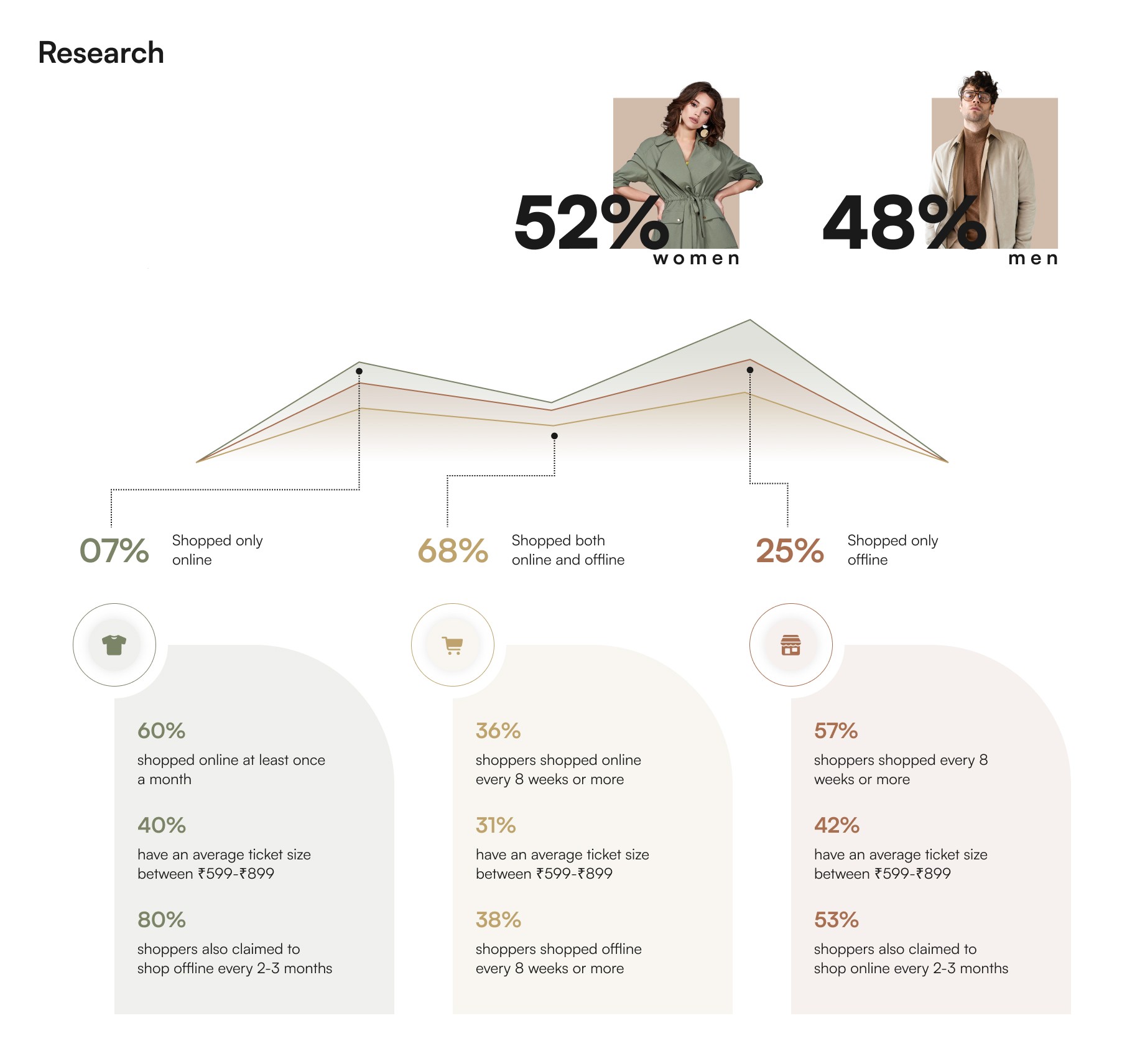
The survey: 52% women, 48% men, and the finding that set the direction - 68% shopped both online and offline.
Three principles, and a decision not to look like a sale site.
Browsing is the primary mode of interaction. People don't search for specific products in fashion - they explore. The experience had to prioritise discovery and visual navigation rather than search-heavy flows.
Decision fatigue increases with scale, so large collections slowed people down and needed ways to narrow choices quickly without losing variety or context. And perception is shaped through interaction, not just visuals - premium had to come from clarity and ease, not from price signalling or discount-driven UI.
The experience shifted from a catalogue-first structure to a browsing-first system with quick filtering and contextual discovery - each user type having a distinct relationship with fashion, a different browsing motivation and a specific friction point in the purchase journey. Navigation and information architecture were designed to reduce friction while supporting large-scale product exploration.
Four calls shaped everything downstream: browsing over search, matching how people behave in fashion both online and off; designing for scale first, so the system could carry a large and constantly changing catalogue; mobile-first interactions, because that was where the behaviour was; and no aggressive sale or discount visual language - a deliberate decision to position Zudio as a brand worth browsing rather than a discount destination.
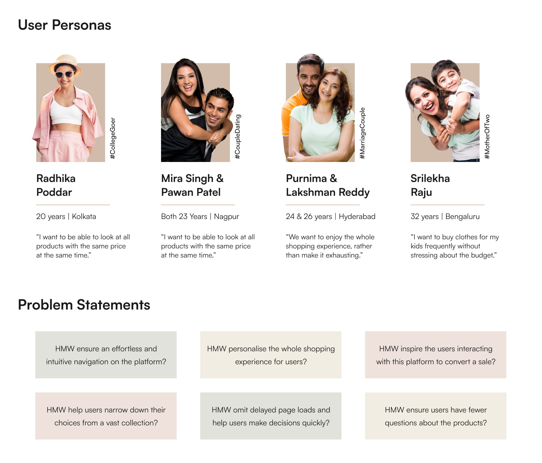
Four shopper types, each with a different motivation, and the how-might-we questions they produced.
Colour as navigation, and a product page built to answer everything.
The visual direction centred on a clean, image-forward layout that let the clothing lead. The design deliberately avoided heavy discount-led visual language - no aggressive red sale banners or cluttered price callouts - to position Zudio as a brand worth browsing, not just a price destination. Key design decisions included colour-based navigation through the Color Shop category, a size chart integrated directly into product pages, “Complete the look” and “Similar Vibes” contextual recommendation modules and a streamlined shopping bag flow that surfaced estimated delivery, coupon application and social links in one view.
Four things carried the experience. Category entry was built around editorial-style tiles, each a full-bleed image rather than a text list, matching how people enter the brand offline. The product detail page was designed to answer every question someone might have before buying, all without leaving the page. Filters and contextual groupings narrowed choices without removing variety, cutting the cognitive load of browsing at scale. And the cart and checkout were streamlined to hold continuity from discovery through to purchase.
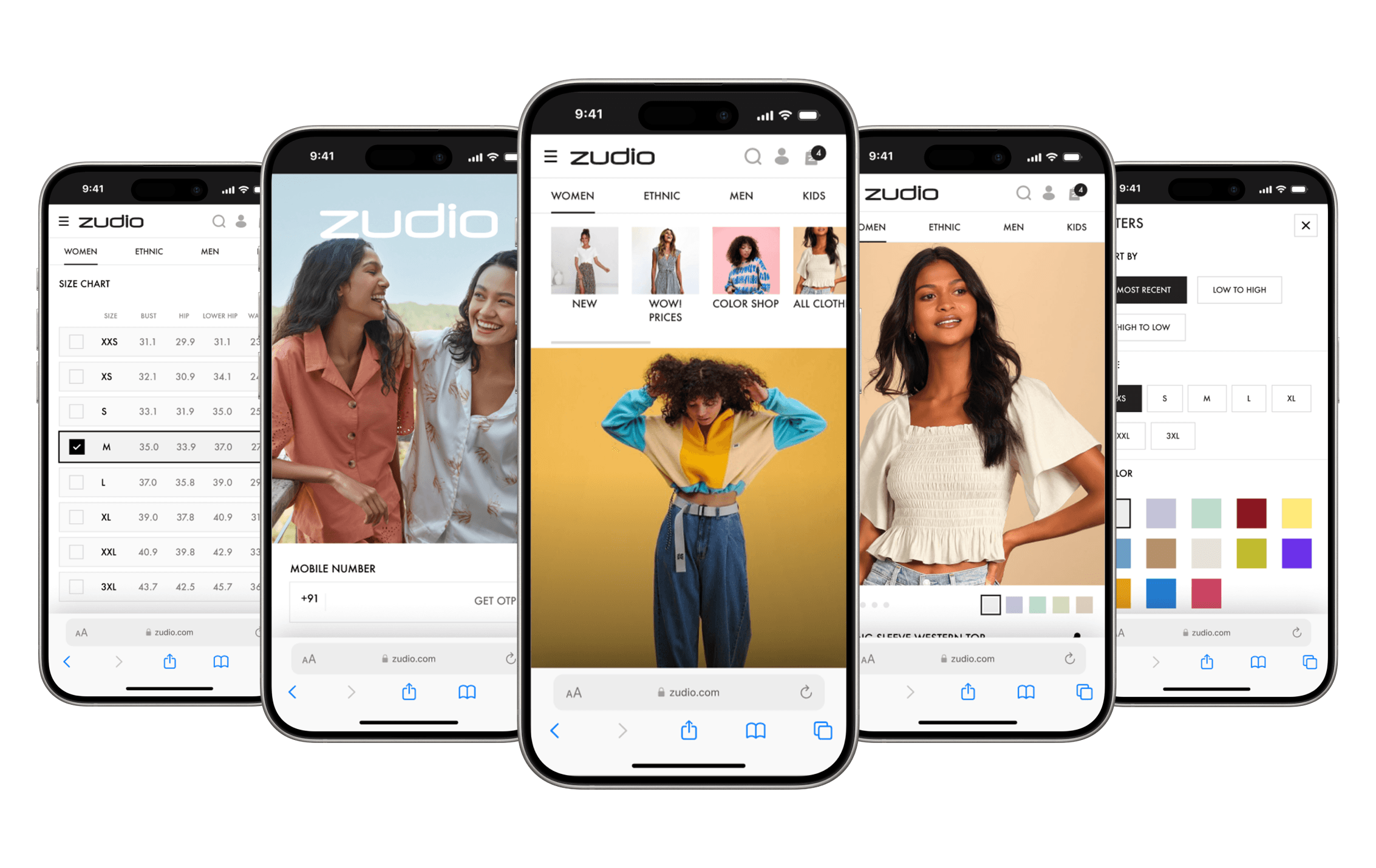
The shipped experience - category entry, product detail, size chart and filters.
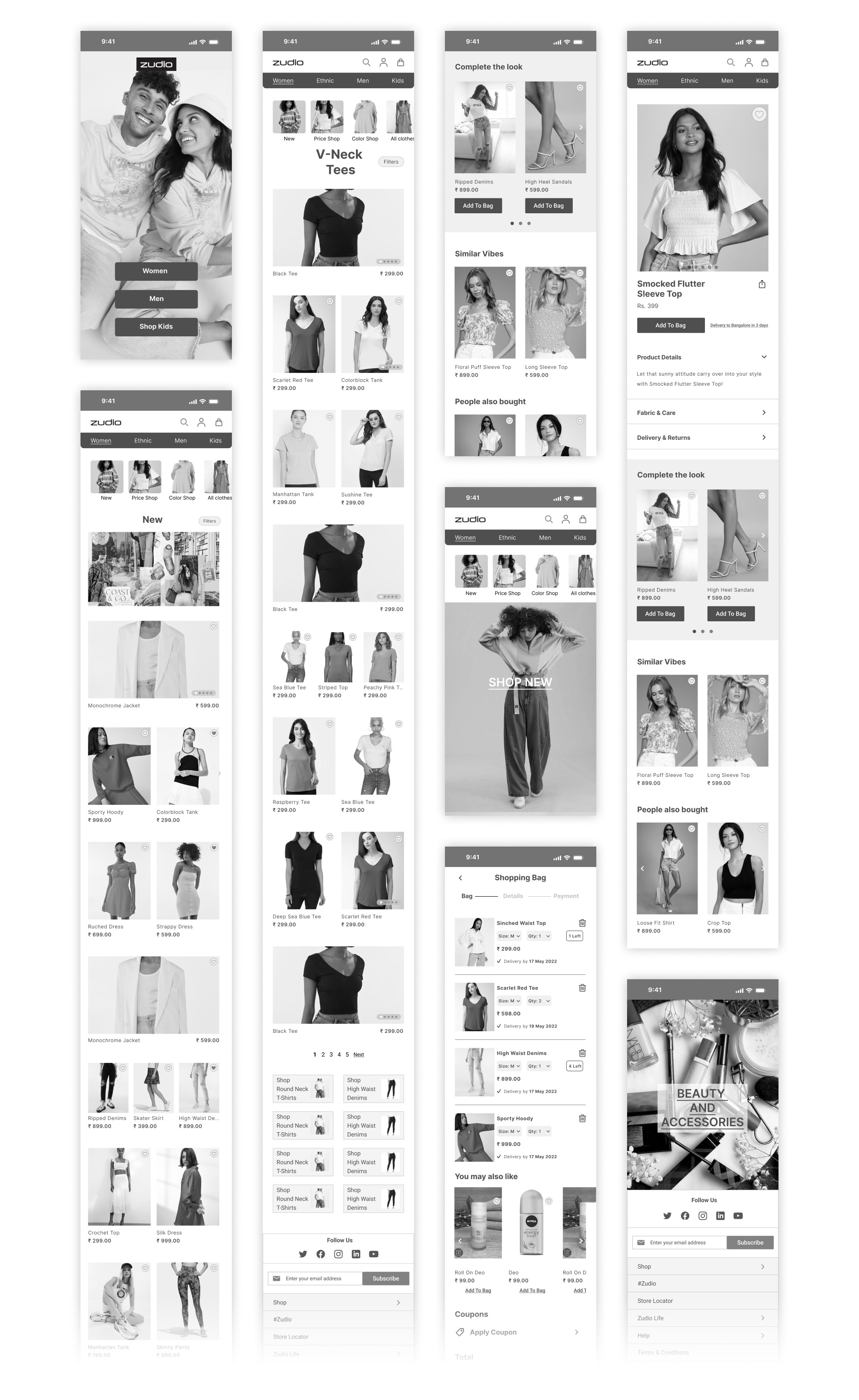
Greyscale flows for category entry, listing, product detail and the shopping bag.
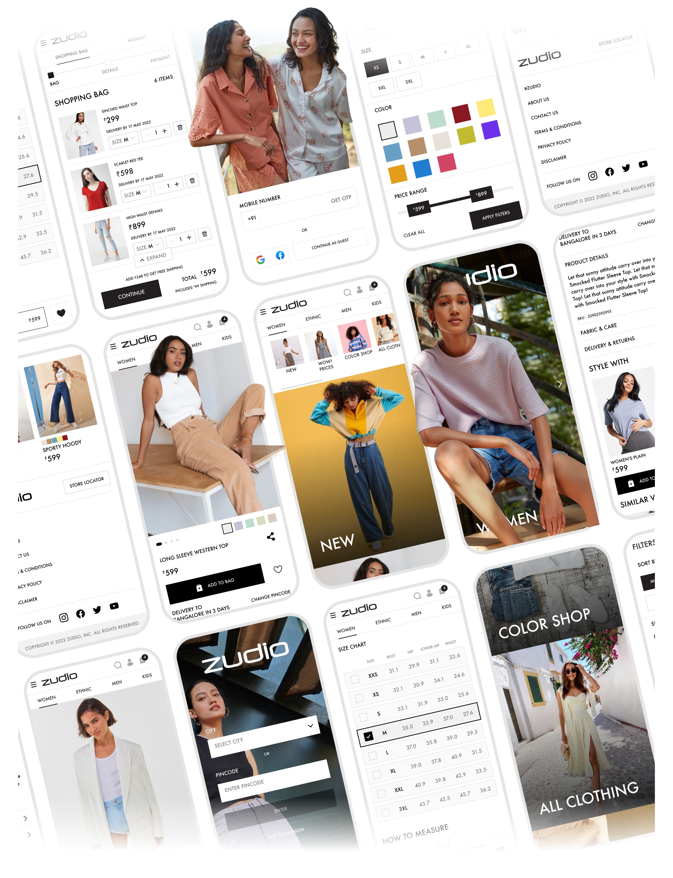
The final interface - Color Shop, the size chart built into the product page, filters and the bag.
Tata Trent took it forward and shipped it.
Tata Trent took the redesigned experience forward and launched it with their internal team. The purchase journey replaced scattered browsing with a structured discovery-to-checkout flow built around how shoppers actually move through a catalogue, and the online experience carried the same energy as the 500+ offline stores rather than sitting as a separate, quieter channel.
Navigation got more efficient across large catalogues, browsing and selection lost friction, the brand gained a credible online presence to match its offline reach, and the system was built to absorb frequent product updates without redesign.
The impact came from treating navigation and product discovery as the primary design surfaces - not the checkout flow. By making freshness, colour and new arrivals visible from the very first screen and building size information and contextual recommendations into product pages, the design addressed the specific friction points identified in the research without adding complexity to the experience.
Brand constraints turned out to be the most useful brief.
Zudio was the project where I learned that designing for a fashion brand is fundamentally different from designing for utility. Every decision had to carry brand feeling alongside function - the grid spacing, the image crop, the way a filter appeared - because users were forming a brand impression alongside a purchase decision. In hindsight, I'd invest more in the search and personalisation layer - the design surfaced new products visually, but a returning shopper who knew what they wanted still had to browse rather than jump directly to relevant results. The broader learning was that brand identity constraints - “we don't want to look like a sale site” - aren't limitations, they're the most valuable design brief you can get.